
Audience
This is an introduction for non technical people who want to know about Data Science, but who do not want or who are not ready to go inside the hood of Data Science.
If you would like to know more about the workings then see the Analysis Part 02 in Kaggle.
Disclaimer: I take full responsibility for errors in this analysis. If you found any, please let me know so that I am able to learn from the error, and update the analysis accordingly. Thank you.
Introduction
This article is a continuation of my previous work; Analysis Part 01. I expanded the analysis with the workings on Pipeline, Cross Validation, Confusion Matrix, the relationship between the model.score(X,y) and the accuracy_score(y_true, y_predicted) , ROC_Curve, ROC_AUC_Score, and Ensemble models (AdaBoost Classifier, and Bagging Classifier) to name a few.
In this iterated work where to figure out more advance parts of the Data Science, I spent more time than I did in the first iteration. This was because I lacked the sufficient grounding on these topics hence the multiple attempts to understand the matters.
I had to read, reread, reread, reread, reread, and reread (to be honest I lost track of how many times I did these) on a number of books, and tutorials about the relevant topics. Also I watched free video tutorials on topics that I was not familiar with. Again the process was repeated multiple times.
Conclusion
The aim of this Analysis Part 02 is for me to understand better the methods used for Data Science. It is the continuation of my previous work, which is an iterated process.
The topic here is a Classification task. This is because I need to classify who died or who survived from the Titanic csv files.
In this article, I go over some parts of the analysis that I believe are beneficial to the readers in terms of knowing more complex parts of the Data Science. My aim is to keep this article to be less technical as possible, therefore, if you want to drill further on some topics, feel free to check the Analysis Part 02.
I start with what was provided in the beginning of the analysis. Kaggle provided 2 csv files, which are train.csv and test.csv, and I converted them to Pandas DataFrames. To use these DataFrames in a Machine Learning model, I had to preprocess them into required characteristics.
I selected the following models for the analysis:
- Logistic Regression, a basic model.
- RandomForestClassifier
- AdaBoostClassifier
- BaggingClassifier
EDA is useful in choosing which columns (or known as features) that can contribute and improve the prediction process.
Using the selected columns in the DataFrame, the next step was to train a model. Afterwards, the model made predictions. We can combine the above steps into a Pipeline. So instead of going through each step manually, the Pipeline runs them automatically.
How do we know that the model is doing well during training the model step? One uses cross validation to check the performance of the model. Essentially, we could see how accurate the model is by comparing between actual Y values of train DataFrame and predicted Y values of train DataFrame.
Confusion Matrix is another method to evaluate the performance of the Machine Learning model. It provides the input to calculate Accuracy, Recall, Precision, and other useful ratios.
From there on, one can calculate ROC_AUC_score. If a model has a higher ratio than other models, it means it is a better model than the rest. It is good to know that model.score(X,y) relates to accuracy_score(y_true,y_predicted), and both outputs are the value of the Accuracy.
Main points
DataFrame
Kaggle’s Titanic competition provides 2 csv files: train.csv, and test.csv.
train.csv file:
- It contains 12 columns (or known as features), and 890 rows.
- The columns include “Survived”, “Age”, “Sex”, and other columns. “Survived” has binary values: 0, and 1. Here 0 = Died, and 1 = Survived.
- The rows are passengers.
Here, the file provides which passenger died and survived in the “Survived” column, plus other 11 columns that a Data Scientist could use to predict “Survived” column.
This means you need to find out which columns can help you predict correctly who survived or died.
test.csv file:
- It contains 11 columns and 280 rows.
- The difference between train.csv and test.csv is it does not have “Survived” column.
So the task here is to find out who survived or died for the passengers listed in the test.csv file.
Preprocessing DataFrame
We are given the 2 csv files. In order to use them in Jupyter notebook, which Kaggle provides, we must change them from a csv format into a Pandas DataFrame format.
After the completion of the above step, we need to transform any Categorical column (for example Yes or No), any blank value, or any N/A value into numerical value.
The reason is a Machine Learning model only accepts numeric values i.e. 0, 1, 99, etc. as inputs. If not, when you execute the model, you will receive an error as the output.
For the analysis, I selected the following Machine Learning models:
- Logistic Regression, a basic model.
- RandomForestClassifier
- AdaBoostClassifier
- BaggingClassifier
Exploratory Data Analysis (EDA)
The aim of the EDA is to find out which column is or columns are relevant in terms of predicting which passenger was alive or dead after the Titanic ship hit the iceberg.
You can create a histogram of a column in order to see if there is a link with the prediction. Among other tools you have are scatterplot, and correlation matrix.
Once you identify which columns are useful, you can drop the rest of the columns.
You can also combine these useful columns into new columns, which would give you better inputs in making the prediction. This process is called Feature Engineering.
After all these processes, you only keep useful columns inside both the train DataFrame, and the test DataFrame.
At the end of this step, you split the train DataFrame into Y values, and X values. This is where Y = “Survived” column, and X = useful columns.
For the test DataFrame, X = useful columns.
Training a model and making a prediction
I selected a Machine Learning model, let´s say ABC. The ABC model could be a Logistic Regression model, or KNN Classifier model, etc. I then FITTED the ABC model using values from the train DataFrame. This means I will get the coefficients, and intercept values for the ABC model. The assumption here is ABC = Logistic Regression.
ABC.fit(X values from train DataFrame, Y values from train DataFrame)The next step is to PREDICT Y values of the test DataFrame. Y values here are the prediction of whether or not a passenger Survived (or equivalently Died).
ABC.predict(X values from test DataFrame)Pipeline
Pipeline is a tool that is used to simplify the above mentioned processes into a single step:
- Transforming categorical columns into numerical value.
- Transforming any blank value in a column or columns into numerical value.
- Transforming any N/A value in a column or columns into numerical value.
- Including the ABC model.
From there you FIT the Pipeline, and PREDICT the Y values for the test DataFrame.
Pipeline.fit(X values from train DataFrame, Y values from train DataFrame)Pipeline.predict(X values from test DataFrame)Cross Validation
We use this method to check the performance of the ABC model with regards to the train DataFrame.
cross_val_score( Pipeline, X values from train DataFrame, Y values from train DataFrame, cv = 10 )By default, the outcome of the code is the accuracy of the model in predicting correctly who Survived or Died. Essentially it compares the actual Y values of train DataFrame against the predicted Y values of train DataFrame.
Confusion Matrix
This is one of the methods used to evaluate how good is the ABC model in predicting who Survived or Died. The Confusion Matrix compares between ACTUAL (ground Truth) Y values, and PREDICTED Y values.
Note on Scikit-Learn, when the ACTUAL Y values contain 0s and 1s then it automatically assigns 0 as Negative Class, and 1 as Positive Class. Also note that there is NO standard way to visualise the Confusion Matrix. Below shows 2 variations of the Matrix.
Variation 01. 
Variation 02. 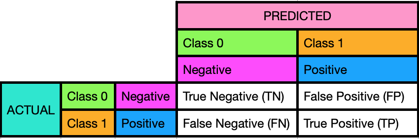
Using the Confusion Matrix, you will be able to calculate manually accuracy, recall, precision and others useful ratios in order to know how useful the ABC model in making prediction is. The higher the accuracy, the better the model is.
Accuracy, Recall, and Precision calculations
Using below formulas, one can compute the ratios for Class 0 and Class 1.
Accuracy = (TP + TN) / (FP + FN + TP + TN)Recall = Sensitivity = True Positive Rate = TP / P = TP / (FN + TP)Precision = TP / (TP + FP)ROC_AUC_Score
ROC_AUC means Area Under the Receiver Operating Characteristic Curve. The available values are between 0 and 1. The higher the ROC_AUC value means the affected model is better in comparison to other models.
Good to know: Relationship between model.score(X,y) and accuracy_score(y_true,y_predicted)
Both model.score(X values from train DataFrame, Y values from train DataFrame) and accuracy_score(Y values from train DataFrame, Predicted Y values) calculate Accuracy.
The function in the model.score(X values from train DataFrame, Y values from train DataFrame) is the accuracy_score(Y values from train DataFrame, Predicted Y values). See the actual codes in the GitHub.
